UI Design Trends 2026, Part 1: Surfaces, Systems, and Experiments
Part 1 of a three-part roundup: 25 UI trends for 2026, judged by what they cost to build, ship, and keep accessible.
Part 1 of 3 · Part 2 → · Part 3 →
This is part one of three. I’m walking through the visual languages and aesthetic movements that keep showing up in 2026 briefs, and giving each one an honest engineering read: what it costs to build, what it does to contrast and focus, and whether it survives contact with a design system. Treat it as a toolkit, not a checklist. You pick two or three of these on purpose, not fifteen by accident. Where I have real experience with something I’ll say so, and where I don’t, I’ll tell you what I’d watch for instead of inventing a story.
UI Design Trends 2026 to Watch
Glassmorphism
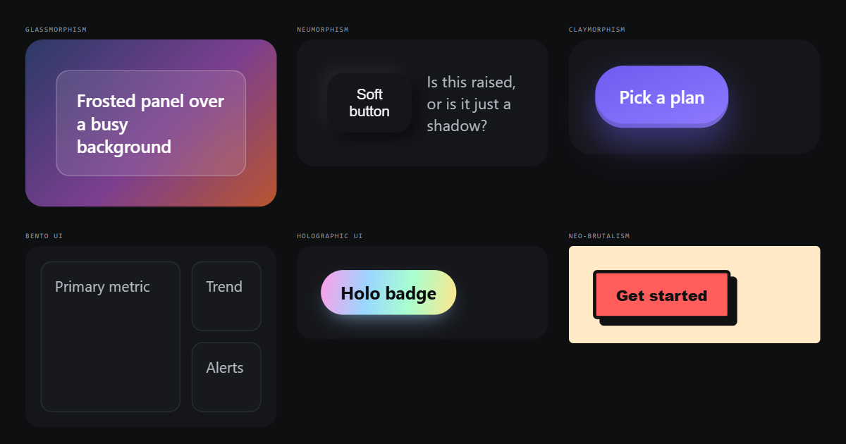
Frosted panels still look expensive, and backdrop-filter is finally boring enough to use without a polyfill conversation. The catch is contrast: text on a blurred, unpredictable backdrop can pass AA in your mockup and fail over a photo two screens later. I keep a solid fallback layer under the blur so the text contrast is guaranteed by the layer I control, not by whatever scrolls behind it. Also watch scroll performance: a blurred element that resizes or moves repaints an expensive region every frame.
Neumorphism
The soft extruded look is built from two shadows (one light, one dark) on a background the same colour as the element. That’s exactly why it keeps failing audits: the only signal that something is a button is a shadow, and shadows aren’t contrast. If you want it, add a real border or a text label, and design a focus ring that survives the aesthetic instead of dissolving into it. It’s a style I’d use for a decorative dashboard tile long before I’d use it for a primary action.
Claymorphism
Chunky radii, saturated fills, and a big soft drop shadow. It’s cheap (no blur, no compositing tricks, just border-radius and box-shadow) and it reads as friendly, which makes it a reasonable fit for onboarding screens, empty states, and illustration-heavy consumer flows. It scales badly into dense data UI, where those fat corners eat horizontal space you needed for numbers.
Skeuomorphism
It never fully left; it just retreated to places where physical metaphor genuinely helps: audio transport controls, camera UI, anything spatial. Used well, it buys you affordance without a tooltip. Used badly, it buys you a folder of high-resolution textures nobody wants to maintain in two years, which is the kind of debt that stays invisible right up until someone needs a dark variant. If you reach for it, reach for the metaphor, not the leather.
Flat Design
Still the cheapest thing to build and by far the easiest to tokenize: colour, spacing, radius, done. The known failure is affordance: when everything is a flat rectangle, users stop knowing what’s clickable. I solve that with state rather than depth, and I make hover, focus, active, and disabled non-negotiable in the component contract, because a flat button with no visible focus ring is a keyboard trap with good typography.
Material Design
Material’s real value in 2026 isn’t elevation or ripples; it’s that Angular Material gives you a component set where the accessibility work is already done and mostly correct. That saves months. The tax is theming: bending Material tokens hard enough to look like your brand is a project of its own, and every major version brings token churn you have to absorb. Decide early whether you’re adopting Material or merely borrowing it, because half-adopting it is the expensive path.
Fluent Design
Fluent matters most when you’re shipping desktop, and I do ship desktop: Rideword is an Electron app. The useful part isn’t acrylic backdrops; it’s platform convention: window chrome, menu behaviour, keyboard shortcuts users already have in muscle memory. Faking native materials in Electron is a lot of effort for a result that still feels slightly off, so I’d rather spend that budget on matching the interaction rules and letting the surface stay plain.
Liquid Glass
The heavier cousin of glassmorphism: layered translucency plus a specular highlight along the edge, so the panel reads as a physical lens instead of a blurred rectangle. It’s genuinely striking on a hero surface and genuinely expensive everywhere else: you’re stacking gradients, borders, and a blur on the same compositing layer. One per screen, on something that doesn’t animate.
Aurora UI
Big soft gradient washes behind content. Cheap to render if they’re static, brutal if they’re animated at full-viewport size. An animated gradient background is one of the easiest ways to drain a phone battery while looking calm. Put your text on an opaque card above the aurora rather than directly on it, and your contrast problem disappears without losing the effect.
Bento UI
Modular grid tiles of varying size, and the one layout trend on this list I’d defend in a planning meeting. CSS Grid does the work, tiles map cleanly to components, and each cell can own its own loading and error state. The trap is accessibility: a visually clever arrangement often means DOM order stops matching reading order. Building accessible dashboards for Generali Vitality at DXC taught me to lay out the source order first and let the grid rearrange it, never the other way round.
Soft UI
Think neumorphism with the dangerous parts removed: gentle shadows, low-contrast surfaces, but real borders and real state changes. This is the compromise I’d actually ship. You keep the warmth, you keep AA contrast, and your focus ring still has an edge to sit against.
3D UI
Real 3D on the web is a budget decision before it’s a design decision: a WebGL scene means a bundle, a GPU, a battery, and a fallback for everyone who can’t run it. Also honour prefers-reduced-motion: for some users a spinning hero is not a delight, it’s a reason to close the tab. This is where I apply the same rule I now apply to memoization: I stopped adding performance habits on instinct after measuring how often they cost more than they saved, and I’d rather measure a 3D scene’s real frame cost on a mid-tier Android device than argue about it in review.
An actual 3D scene needs WebGL, so this is the cheap tier. The honest version of the trend costs a renderer and a fallback.
Holographic UI
Iridescent gradients, colour shifts on hover, chrome-like sheen. Fun, entirely decorative, and dangerous the moment meaning depends on it. A shifting gradient makes text contrast a moving target and can’t be relied on to convey state. I’d use it on a badge or a card edge, never as the only indicator that something is selected.
Spatial UI
Headset and depth-based interfaces aren’t my daily surface, so I’ll be straight about that. What does transfer to normal web work is the mental model: depth as an ordering system, focus as something that moves through space rather than a list, and interactions that must stay usable when the pointer is imprecise. If nothing else, spatial design is a good argument for finally taking hit-target size seriously.
A flat page can only gesture at this: real spatial UI is parallax, head tracking, and hands, none of which survive a screenshot.
AI-native UI
This is the one I’ve actually built. At Lunatech I built a conversational AI frontend that replaced form-based reporting for a Porsche client, and I’ve built personal products that orchestrate several AI providers behind one interface. The design problem isn’t the chat bubble; it’s showing uncertainty, making the model’s output correctable, and never letting a generated value slip into your state as if a human typed it. I treat model output as untrusted input and validate it through schemas before it reaches the UI, which also gives the interface something concrete to render when the output is wrong.
Modern & Experimental Aesthetics
Brutalism
Raw HTML energy: system fonts, hard borders, visible structure, no ornament. It’s fast, it’s honest, and it’s the easiest style on this list to make accessible, because nothing is hiding. It’s also loud, and for most product work the volume is the problem rather than the look.
Neo-Brutalism
Brutalism with a colour palette and a hard offset shadow: thick borders, flat fills, no blur. It’s cheap to build, tokenizes well, and has an underrated advantage: with borders that heavy, focus and hover states are trivial to make obvious. It dates fast, so keep it in a theme layer you can swap rather than baked into every component.
Maximalism
More of everything: layered type, patterns, colour, texture. The engineering reality is an asset budget: fonts, images, and background layers add up quickly, and maximalist pages are where Largest Contentful Paint goes to die. If a client wants maximalism I’d rather agree on a weight budget up front than discover the problem in a Lighthouse run the week before launch. That’s the same instinct I have about estimates generally: surface the constraint early with the real options, don’t defend it later.
Four background layers, three type treatments, and an LCP problem you'll meet in the last sprint.
Minimalism
Minimalism is a discipline about what you remove, and it goes wrong when teams remove affordances instead of noise. Fewer visible controls doesn’t mean a simpler product; it usually means the complexity moved somewhere less discoverable. Strip the decoration, keep the labels.
Members keep read access. You can restore it later.
Swiss International Style
Grid, hierarchy, restraint, real typographic scale: the movement that quietly became design tokens. Almost everything durable in a design system traces back to this: a spacing scale, a type ramp, a column grid, consistent alignment. Of all 25 items here, this is the one I’d bet is still useful in ten years, because it’s a set of rules rather than a surface treatment.
Grid
column grid,
one alignment.
Everything hangs off the same left edge. The scale carries the hierarchy, so nothing has to be centred and nothing has to be decorated.
Editorial Design
Long-form layout thinking applied to product: generous measure, a real type ramp, pull quotes, asymmetry that serves reading. It’s having a moment in marketing sites and documentation, and it works because reading is the actual task. Keep line length near 60-75 characters and most of the effect comes for free.
Set the measure first. Most "bad typography" is a line-length problem wearing a font-choice costume.
Pull quoteOrganic Modernism
Curves, blob shapes, soft asymmetry: a reaction to the rectangle. Mostly harmless: large radii and clip-path are cheap, and SVG blobs compress well. Animating a clip-path is not cheap, so if the blobs need to move, move them with transform instead.
Abstract Geometry
Layered shapes as background and section dividers instead of stock photography. Cheaper than imagery, more distinctive, and infinitely themeable if you build it from tokens. One rule: mark it aria-hidden, because decorative SVG that announces itself to a screen reader is noise, not art.
Deconstructed Design
Broken grids, overlapping type, elements that spill outside their container. The visual idea is fine; the engineering risk is that it usually pulls DOM order away from visual order, which breaks tab sequence and screen reader flow. In review I’d flag that as a blocker rather than a suggestion, because it’s a concrete failure path; a keyboard user landing in a nonsensical order isn’t a matter of taste. Everything else about the style is a preference, and I’d say so.
Anti-Design
Deliberately awkward: clashing colour, mismatched type, intentional friction. Done with intent it’s a strong statement for a portfolio, a launch page, or a brand that can afford to be strange. Done without intent it’s just an untested interface. Either way the boring parts still apply (keyboard paths, focus, contrast on anything you actually need people to read), and if those hold, break whatever else you like.
Clashing on purpose. The one thing that isn't a joke is the contrast on the text you actually have to read.