UI Design Trends 2026, Part 2: 3D Effects and Retro Revivals
Part 2 of a 3-part roundup: twenty 3D and retro UI trends for 2026, judged on what they actually cost to ship and maintain.
← Part 1 · Part 2 of 3 · Part 3 →
This is part two of three. Part one covered layout and interaction patterns; part three will get into typography and motion systems. This one is about the loud stuff (3D, chrome, glitch, neon), and I am not writing it as a designer, because I am not one. I am the person who gets handed the comp and has to make it load fast, stay readable, and still be maintainable two years later. So for each of these twenty, the question is narrow: what does it cost in paint time, accessibility, implementation effort, and future regret? A visual effect nobody ever profiles is exactly the kind of debt that never blocks a release and never gets fixed.
3D & Visual Effects
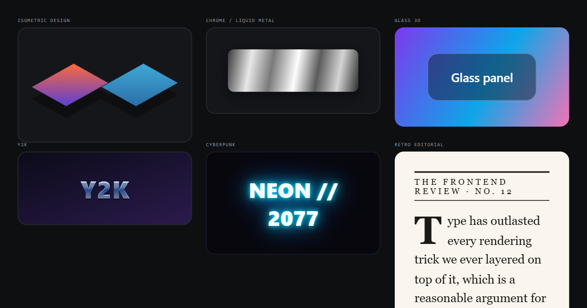
Isometric Design
The cheapest 3D on this list, because most of it isn’t 3D at all: it’s flat art at a fixed angle. Pure SVG or a couple of CSS rotateX/rotateZ transforms will get you there with no runtime library and no GPU pressure worth measuring. The real work is semantic: an isometric diagram of your architecture is information, not decoration, so it needs a text equivalent nearby rather than an aria-hidden shrug. Of everything in this section, this is the one I’d ship without a second thought.
Low-Poly 3D
Low-poly reads as “lightweight” and then arrives as a WebGL scene, a renderer bundle, and a model file. Three.js plus a loader plus your geometry is a real chunk of JavaScript before a single triangle appears, and it lands on the same main thread as your hydration. Nine times out of ten, a pre-rendered WebP of the same scene gets you the identical visual at a fraction of the budget. Keep the live canvas for cases where the user actually rotates the thing.
Hyperreal 3D
Photoreal renders are gorgeous and have no business running live in a browser. On mid-range Android, a hyperreal scene with real lighting will heat the device, drain battery, and drop your interaction latency into the range where people think the page is broken. Bake it. Export stills at two or three densities, serve them through srcset, and spend the saved milliseconds on something the user can feel. The only place I’ve been comfortable with heavy live rendering is a desktop shell like Rideword, where you control the GPU story and the app is already installed.
Chrome / Liquid Metal
Chrome is a gradient trick (banded light and dark stops, sometimes animated), so it’s inexpensive to draw. The problem is that it’s a moving contrast surface. Text set in liquid metal has no stable ratio against anything, and any WCAG measurement you take is a lie the moment the gradient shifts. I’ll ship chrome as a divider, a badge, a hero flourish. Never as the background behind something a user has to read.
Holographic
Holographic surfaces usually mean a conic gradient under a mix-blend-mode, often with backdrop-filter on top. Each of those forces a new stacking context and a compositing pass, and stacking three of them on a scrolling list is how you turn a 60fps page into a stuttery one on a Chromebook. If it animates, it belongs behind prefers-reduced-motion. A shifting rainbow is genuinely unpleasant for people with vestibular sensitivity. Small, static, and used once per screen, it’s fine.
Iridescent
Iridescence is the well-behaved cousin: usually just a multi-stop gradient clipped to a border or to text, no blending, no filters. background-clip: text on a heading costs essentially nothing and degrades to a solid colour if you set a sensible fallback first. Watch the light end of the gradient though: pale yellows and mints against a dark background routinely fail AA, and you won’t notice because the darker stops look fine. Test the worst stop, not the average.
Glass 3D
backdrop-filter: blur() is the single most expensive property most teams reach for without measuring. It re-blurs whatever sits behind it on every frame that region changes, which means a sticky glass header over a scrolling page is a continuous full-width repaint. It also breaks contrast in a way you can’t lint for: the card is readable over your marketing photo and unreadable over the user’s uploaded one. If you ship glass, put a semi-opaque solid layer underneath so text always has a guaranteed floor.
Paper Cut
Layered paper is stacked shapes and offset shadows. That’s it: no filters, no canvas, no dependency, and it prints and screenshots correctly, which matters more than people expect. Depth here comes from position and shadow rather than colour, so it survives high-contrast mode and forced-colors reasonably well. It’s one of the few styles in this section I’d expect to still look deliberate in 2030 rather than dated.
Inflatable 3D
Puffy, over-inflated shapes are achievable with border-radius plus inset highlights and a soft drop shadow: CSS only, no assets, trivially themeable. Two practical cautions. First, the soft-glow shadows push perceived edges outward, so people misjudge where a button actually starts; keep the real hit area generous and don’t let the visual bleed define the target. Second, this reads playful by default, and playful is a poor fit for anything financial or medical.
Toy-like 3D
Mascots and bouncy props almost never arrive as CSS. They arrive as Lottie or Rive files that someone outside the codebase owns, which makes every future tweak a scheduling problem rather than a pull request. The runtime cost is manageable if you lazy-load and pause offscreen; the springy overshoot motion is the part that needs a reduced-motion path. Before you adopt one, decide who redraws it when the brand colour changes, because “the agency” is not an answer that survives a year.
Retro & Nostalgic Styles
Y2K
Bevelled chrome, star sparkles, bubble type. Technically it’s gradients and shadows, so it’s cheap, and the whole look can live in a stylesheet with no assets at all. The cost is legibility: Y2K loves outlined and beveled text at small sizes, which is exactly where letterforms stop resolving for anyone with reduced vision. Cap it at display sizes and keep body copy in something boring.
Frutiger Aero
Glossy buttons, water, wet-look highlights. This is layered gradients and a pseudo-element for the shine: no filters, no repaint concerns, genuinely inexpensive. The subtle danger is that gloss overlays reduce the effective contrast of any label sitting on them by a surprising amount, and designers tend to check the flat state only. Sample the actual rendered pixel under the highlight, not the base fill.
Vaporwave
Saturated magenta on cyan is the accessibility trap of this entire list. Those two hues sit close in luminance, so the pairing that defines the style is often around 1.5:1 (visually loud, practically unreadable, and worse for anyone with a colour vision deficiency). I spent a long stretch at DXC building wellness dashboards to WCAG AA for blind and low-vision users, and the lesson that stuck is that “it looks vivid on my monitor” and “it is perceivable” are unrelated claims. Use the palette for backdrops and set your type in white or near-black.
Retro Futurism
Warm creams, burnt orange, chunky geometric shapes, rounded slab type. There’s almost nothing to implement (it’s a palette and a type choice), so it carries no runtime cost and no browser support risk. It also ages slowly, because it’s already referencing something fifty years old. If a stakeholder wants “distinctive” and you want to keep your performance budget intact, this is the trade I’d offer them.
Cyberpunk
Neon glow is text-shadow and box-shadow at large blur radii, and blur radius is not free: animate a dozen glowing elements and you’re re-rasterising large areas every frame. The glitch effects that usually come with it are worse: rapid horizontal displacement is both a motion trigger and, at certain intensities, a flicker risk. Make the glitch a one-shot on load, honour reduced-motion, and never loop it behind body text. Dark-on-dark neon also fails contrast far more often than it looks like it should.
Synthwave
The horizon grid is a perspective-transformed repeating gradient, which the compositor handles well as long as you leave it static. Scroll it, and you’re repainting a full-viewport background on every frame. That’s the version that shows up as jank on integrated graphics. Promote it to its own layer, keep the animation to transform, or just ship it as a single SVG. The sun-and-grid motif is also the most recognisable cliché here, so expect it to date faster than the rest of the category.
Memphis
Squiggles, confetti triangles, flat primary blocks. It’s vector art, it compresses beautifully, and it costs nothing to render. Two things go wrong in practice: the shapes visually compete with real interface affordances, so users try to click decoration, and the confetti often ends up as separate DOM nodes that clutter the accessibility tree. One inline SVG, marked decorative, keeps it clean.
Pixel Art
Pixel assets are tiny, and image-rendering: pixelated keeps them crisp when scaled, so the payload argument is genuinely in its favour. Pixel typefaces are the problem: they’re bitmap grids pretending to be fonts, they don’t hint, and below about 16px they become guesswork for anyone who isn’t looking at a perfect display. Use pixel art for icons, illustrations, and headings; keep the interface itself in a real text face.
Arcade Aesthetic
CRT scanlines are a repeating gradient overlay, cheap to draw and surprisingly costly to live with. Every scanline sits on top of your content and reduces its measured contrast, so a palette that passed AA on its own quietly fails once the overlay lands. Animated flicker or rolling bars are worse: that’s the exact pattern flicker-sensitivity guidance exists for. If the client wants arcade, I’ll give them the palette, the chunky borders, and the sound design, and argue hard against a moving overlay.
Retro Editorial
Big serifs, hairline rules, drop caps, generous measure. This is the least expensive thing in the roundup and probably the most durable: it’s typography and spacing, both of which your design tokens already handle. It’s also the only style here that tends to improve accessibility, since the whole aesthetic depends on comfortable line length and real hierarchy. The one implementation detail worth care: a ::first-letter drop cap needs the right initial-letter or float treatment so it doesn’t overlap descenders on narrow screens.
Type has outlasted every rendering trick we ever layered on top of it, which is a reasonable argument for spending the budget here first.
Pick one or two of these per product, measure them on the cheapest device your analytics say people actually use, and write down what you decided so the next engineer doesn’t inherit a mystery. Part three covers typography systems and motion, where the trade-offs get less dramatic and considerably harder to reverse.