UI Design Trends 2026, Part 3: Typography, Layout, and the Organic Turn
Final part of the 2026 UI trends series: seventeen typography, layout, and organic design trends, judged from the build side.
← Part 1 · ← Part 2 · Part 3 of 3
This is the last part of the series, and it splits cleanly in two. Typography and layout are where I actually live: type scales, grid tokens, focus rings, reflow at 320px, the stuff I’ve shipped in design systems and rebuilt in legacy apps for years. The nature and organic half is not my lane; I’m a frontend engineer, not a visual designer, so for those seven I’ll tell you what they cost to build, maintain, and keep accessible rather than pretend I have taste opinions worth charging for.
Typography & Layout Trends
Kinetic Typography
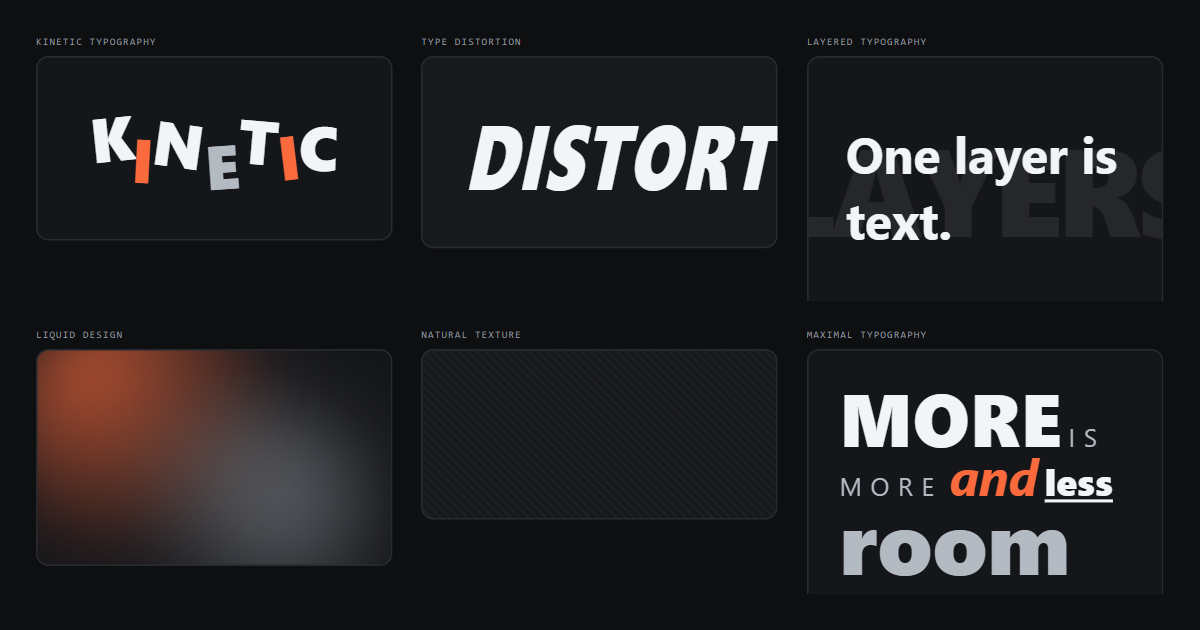
Letters that move on scroll or hover are cheap to prototype and expensive to maintain. The two questions I ask before approving one: does it still read at a freeze-frame, and does prefers-reduced-motion: reduce land it somewhere legible instead of mid-transform? If the answer to either is no, it’s decoration that breaks for a real group of users. Here’s the freeze-frame version (same composition, zero motion):
Animate transforms and opacity only. The moment someone animates font-size or letter-spacing across a hero, you’ve bought layout thrash on every frame.
Oversized Typography
Big type is the least risky trend on this list, because a heading is already a heading. The site’s own scale handles it:
This heading is the demo
The engineering catch is the small end, not the big end. Clamp your headline so it scales with the viewport but never overflows or drops below a readable floor:
Tight letter-spacing that looks sharp at 4rem looks cramped at 1.75rem, so pair the clamp with a spacing adjustment rather than setting one value and hoping.
Experimental Typography
Broken baselines, letters used as containers, text that fights the grid on purpose. Fine on a portfolio, dangerous in a product. The line I draw is whether the experiment lives in the DOM as real text with a sane reading order, or whether it’s been chopped into spans that a screen reader announces one character at a time. If you split characters for effect, wrap the whole thing with an accessible name so assistive tech gets the word, not the confetti.
Every letter there is its own span with its own size, weight, and baseline offset, which is exactly why the wrapper carries role="img" and an accessible name. Without it, a screen reader reads seven fragments instead of one word.
Variable Typography
This one is genuinely useful and undersold. One variable font file replaces six static weights, which is a real payload win on content-heavy screens. It’s the kind of thing I cared about a lot on the Disney booking flows at RCG, where every kilobyte competed with imagery. Expose weight and optical size as design tokens rather than raw font-variation-settings strings scattered through components; in every design system I’ve built, anything that isn’t a token eventually becomes a one-off someone has to hunt down.
Four stops on one axis, one file. The design-system version of that demo is four token names, not four font-variation-settings strings pasted into four components.
Typography-as-Image
Type carrying the whole visual load, no photography: cheap to render, sharp on every display, and it never blocks on an image request. Two rules keep it honest: it must stay selectable text, and it must survive translation into a language with longer words than English. I’ve seen more “typographic hero” designs break on Dutch compounds than on any technical constraint.
IS THE
IMAGE
Zero image requests, crisp at any DPI, and every word above is real text you can select and translate. Set the size with clamp() and give the line box room to wrap, because the German version of that headline is going to be longer.
Grid-Based Design
Visible structure came back, and I’m glad. CSS Grid with named areas and a token-driven gutter is the most maintainable layout primitive we have, and unlike the float and flex eras, the mental model matches the picture the designer drew.
Keep the column count and gutter in tokens. Teams that hardcode grid-template-columns per page end up with four grids and no system.
Collage Design
Overlapping cutouts, mixed media, deliberate mess. It photographs well in a case study and it fights you in code: every overlap is a stacking-context decision, and absolute positioning means the layout has no opinion about what happens when text grows. If a collage is worth building, build it as a grid where children share cells and overlap by choice, not as a pile of position: absolute with magic numbers.
That is four hardcoded offsets and three rotations, and it only holds because nothing inside it can grow. Rebuild the same composition with the pieces stacked in one grid cell and the mess becomes something that survives a longer caption.
Layered Typography
Ghosted words behind a headline, outlines stacked under solid type. Visually strong, and mostly safe if only one layer is real text:
The decorative layer gets aria-hidden, and the real layer needs contrast measured against the blended result, not against the base background. That check is where most layered heroes quietly fail WCAG AA.
Type Distortion
Skew, stretch, warped baselines. It reads as intentional at display sizes and as a rendering bug anywhere near body copy.
Do it with transform on a wrapper, never by inventing a stretched font, and cap it to one element per screen. Distortion also destroys the relationship between rendered size and reported font size, so it should never touch anything a user is expected to read at length.
Maximal Typography
Everything loud, all at once: mixed sizes, mixed weights, no whitespace to hide in.
Maximalism only survives contact with a real product if the hierarchy underneath is boring and strict. When there’s no whitespace left to signal importance, size and weight are doing all of it, so define those steps once, in tokens, and let the noise sit on top of a system rather than replace it.
Nature & Organic Aesthetics
Everything below sits outside my day job. I don’t design these; I get handed them, and my job is to say what they cost.
Biomorphism
Interfaces shaped like living things: bulging panels, cell-like clusters, growth-inspired arrangements. From the build side, the cost is that these shapes rarely map to a box model, so you end up with SVG or clip-path wrappers around content that still needs to be a rectangle for text reflow. It’s workable for a landing page and a maintenance tax anywhere with dynamic content, because every shape has to be re-tuned when the copy length changes.
Five cells, five hand-tuned radii, and not one of them wants a paragraph inside it. That’s the whole trade: the shapes are free, and the moment real content has to live in them, you’re back to a rectangle with a decorative wrapper around it.
Liquid Design
Flowing gradient forms, blurred blobs, morphing backdrops.
CSS gradients plus filter: blur() gets you most of the look with no image payload, which is the version I’d approve. The version I’d push back on is the animated WebGL blob: it burns GPU on low-end Android, drains battery, and needs a static fallback anyway for reduced-motion users, so you’re building it twice.
Organic Shapes
The tamed cousin of biomorphism: asymmetric radii instead of full-on cell structures.
This one’s genuinely cheap: eight numbers on border-radius, no extra elements, no repaint cost. Two cautions: an organic radius on an interactive element makes the focus ring follow the same curve, which is fine, but an organic clip-path can crop the ring entirely. And hit areas should stay rectangular even when the visual doesn’t.
Botanical Design
Leaves, vines, pressed-plant illustration as the decorative layer. Almost all of the cost here is asset cost, not code: SVG if you want it to scale and recolor per theme, raster if the illustration is painterly, and someone has to own a dark-mode variant either way. My only firm engineering opinion is that botanical ornament belongs in the background layer with aria-hidden, never inside a heading or a button, where it becomes something a screen reader has to narrate.
Two border-radius corners and a rotation per leaf, no asset pipeline. It recolors with the theme for free, which is the argument for keeping simple botanical ornament in CSS or SVG. And the wrapper is aria-hidden, because it says nothing.
Earthy Minimalism
Warm neutrals, clay and moss tones, generous space. This is the easiest organic trend to ship well, because it’s a palette change plus restraint, no new primitives. The trap is contrast: earthy palettes cluster in the mid-tones, and a sand-on-clay pairing that looks calm in a mockup often lands at 3:1. Run the numbers on body text, muted text, borders, and disabled states before the palette is signed off, not after.
Moss on sand: calm in the mockup, 2.4:1 in the checker.
The swatch row is the easy part. That last line is the trap: it’s the exact pairing that keeps showing up in earthy mockups, and it fails AA for body text by a wide margin. Bark on sand clears it; moss never will.
Natural Texture
Paper grain, linen, stone. Pure-CSS versions are basically free:
Repeating gradients or an inline SVG feTurbulence beat a tiled JPEG on payload and stay crisp on high-DPI screens. Keep texture opacity low enough that it never eats into text contrast, and keep it off scrollable surfaces where the repeat can shimmer during fast scrolls.
Biophilic Design
The broadest of the seven: daylight-mimicking color, natural imagery, layouts meant to feel less machine-made. I can’t evaluate whether it makes people calmer. That’s a research claim, not a frontend one. What I can say is that the implementations tend to lean on ambient video, large photography, and slow parallax, which is three of the most expensive things you can put on a page. If a team wants the effect, get it from palette and spacing first and only add motion or media once you’ve measured what it does to LCP on a mid-range phone.
That panel is two gradients and weighs nothing. The version with an ambient sunrise loop behind it looks maybe fifteen percent better and costs you an LCP element, a decode, a reduced-motion fallback, and someone’s battery, which is the whole argument for taking biophilic design as a palette brief first.
Closing the series
Three parts in, the thing that actually shifted for me is the order of the questions. I used to evaluate a visual trend by asking how hard it is to build; now I ask what it does to text at 200% zoom, what happens when motion is off, and who maintains it in eighteen months when the person who loved it has moved on. The accessible dashboards I built at DXC for blind and low-vision users left me with a permanent bias here: readability isn’t a constraint you trade against style, it’s the part of the design that has to survive every style. Most of these seventeen trends can clear that bar (layered type, organic radii, big display type, honest grids) as long as the structure underneath is boring, tokenized, and shared. The ones that can’t are usually the ones that were only ever going to look good in the case study.